Showing posts with label illustrator. Show all posts

Tuesday, May 21, 2013

Graphic Design Pet Peeves

In honor of my impending graduation, I figured I should enlighten you all about the joys of being a graphic designer. I love being a designer. I really do. But like any other job, certain things get really annoying.
 
*Disclaimer: I don't mean this to be offensive. I don't care if you like Comic Sans. Personal preference. This is just from my experience in the four-ish years I've been doing this, professionally and in school.
 
 http://twistedsifter.files.wordpress.com/2012/02/what-my-friends-think-i-do-what-i-actually-do-graphic-designer.jpg
 
 
Using periods in phone numbers instead of dashes.
Not using the oxford comma.
Photoshop Error: "Not enough ram".
Linked files with no source file to be found.
Papyrus / Comic Sans.
Lens flares.
Not outlining your freaking fonts.
Flat black. (100% K. Read more on this post.)
Designers that rasterize their PDFs before sending them to me.
Things not lining up with things.
Widows and orphans.
(Lines.
Like.
This.)
Looking through so many fonts that words look like random letters put together. Seriously. Stare at the word together for a while.
"Make it POP!"
Almost having a heart attack when Illustrator is saving and I haven't saved in like 3 HOURS and it says "NOT RESPONDING". And then it saves and I'm like OMG. GIVE ME OXYGEN.
Corel Draw. I hate you. Please go away. 
Working on a design and forgetting to do things like use the restroom, eat, breathe...
"Can you teach me to be a designer?" "Can you teach me Illustrator?" No. 
Logos that have ABSOLUTELY NOTHING to do with the company.
Clients that don't know what they want. But know what they don't want when they see it.
Having people watch my screen over my shoulder.
 
 
As you can tell... I could go on and on.
I love being a graphic designer, don't get me wrong, but sometimes things are just irritating.


Do you have pet peeves with your job?
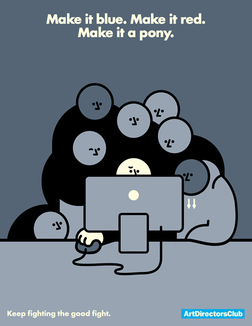

 
 “Make it blue. Make it red. Make it a pony.” - Art Director’s Club. Absolutely hilarious.  
vincentgabriele:

ArtDirectorsClub


Signature

Tuesday, May 14, 2013

If it weren't for the last minute, I would never get anything done.

I have been a bad design blogger. I don't talk much about design, I don't do tutorials anymore, and overall I just suck.

But today, today I turned in my final project for Integrated Graphics. I literally started it like last week. And the majority of it I did over the weekend.

The project was that we had to come up with an original game idea, and make a case, a cartridge or disc (depending on the system, obvi.) and a manual to go along with it. 

Procrastination is like my worst trait, but it's hard not to when I know I do well under pressure. ;)

My worst problem with this project was that I couldn't figure out what game to make. And then it came to me.. Just Dance with zombies! We all know how I feel about zombies

This project was done exclusively in Illustrator. I'm kind of an Illustrator nerd. I was going to do the manual in InDesign, but at the last minute, it was just easier to it in Illustrator. I'm lazy like that.

I feel so much better that this project is now turned in. Now all I have left is a couple of performance tests in the programs (Illustrator, InDesign, and Photoshop) on Thursday, and another next Thursday, and then I graduate next Thursday night (May 23rd). So much excitement!

I have another class that I am in this semester, but this project beats my other final project. Maybe I'll show that one too. But I like zombies. Let me know what you think! I'd love to see what you guys think.

Zombie Dance Party


Disc


Signature

Friday, December 7, 2012

Freebie Friday: Christmas Clipart!

So you know a bad way to wake up? 
A cat biting your toes.
I don't recommend trying it at home.

But despite that happening (for the second time.. Loki wants me up early, I guess) I am in a pretty good mood!

(It might be that candy bar I had for breakfast. Who knows?)

Do you have plans for the weekend? I hope I can get the rest of my list of gifts bought! (If my bank allows)

Oh, and then there is this:


So I will probably be pretty busy.
But I love being busy! It means that I am needed. And who doesn't like to be needed?

Anyway. I have a gift for you today, because it's Friday, and because I love you! 


Christmas clipart! Click on the image to download the file at full resolution. It's a transparent PNG, so you can overlay it over other things. If you have problems with this, please let me know.

In other news, I have figured out that I love drawing snowflakes! Aren't they beautiful? Something we never get to see here in this part of California. :(

I hope ya'll have a great Friday, and I think I am going to write up a post about my design process so far. But who knows. Maybe I'll come up with something more interesting!


Signature

Saturday, December 1, 2012

Design Tips: Vector Vs. Raster

Graphic Design can be a fickle thing. One minute you are designing an awesome logo, right, for business cards. Then, the client loves it so much that they want to put it on a billboard! Awesome right?
Well, it could go both ways. Did you create it in Photoshop, or Illustrator? (Photoshop can do some vector, but I'm generalizing here.) 

Chances are, if you created it in Photoshop, it isn't going to work and you are going to have to start alllllll over. Unless of course you started working at the size of the billboard. (Quick tip: Always, always easier to design larger and scale down than the other way!)

If you created it in Illustrator, you are good to go!

But why does it matter?

The difference is in two words: Raster and Vector.

Basically, these are both ways of how your artwork is created. 

The top picture on my above collage is Raster. You may remember it from my Fall Palette post. Raster is a grid of colors that make up the pieces of your artwork. All those squares of color make up larger spots of color and so on. These squares make up your DPI, or PPI. In Raster, the DPI is very important because that is how many squares you have in a given inch. (DPI = Dots Per Inch, also called PPI, or points per inch). The more squares, the more seamless the transition from color to color, which makes the image look sharp. The problem with this system is that if you create small artwork and then need to resize it, instead of have a bunch of tiny boxes with almost seamless color, you are just enlarging the boxes, making the once seamless color look boxy and pixelated. Make sense?

I hope so. That took a lot of thought to explain.

Vector is a little bit easier. Vector is basically created with mathematical equations. In the above picture, I show the points on the lines. Illustrator (or other Vector program) creates your artwork based on the equation of the distance between those two lines. When you enlarge your artwork that is vector, the equation is just multiplied exponentially, depending on how you scale it. Vector artwork can be rasterized, also, and has to be for some applications, but it is hard to vectorize rasterized artwork. It, in theory, has to be recreated.  If that makes sense.

Now, I'm not saying to never use raster artwork, or to kill Photoshop. None of that. (I love Photoshop!)
I'm just saying it has its place in certain applications. As does Illustrator.

Photos will not be vector. They could, but the files would be too massive for most computers. And it you would basically have to recreate it. 

And also, a lot of effects in Photoshop aren't available in Illustrator. Vector just can't create some of the same effects with the equations and what not. 

My advice to you is for applications like logo design: Create a vector logo. Or have one made for you, in either .EPS or .AI. A good designer should have no problem with that. And once you have that, if you need edits made in Photoshop, you can do so. But keep your vector file.

You may need it. 

But, chances are that if you are creating something for yourself, and you're not a graphic designer by trade, you probably won't ever see Illustrator. That's fine. A lot of designers go their whole lives without touching Illustrator. I am just pretty much a Illustrator fan girl. But if this situation sounds like you, my advice is to always create larger than what you need. Scale down. Always. If you are making your business card, I would say design at least a few times larger. Maybe if your business grows you will need a banner. And then that enlarged logo will be helpful.

I hope this helps. I hope I explained everything okay. As always, feel free to contact me, or leave comments and I will always get back to you!


Signature

Saturday, November 24, 2012

Design Tips: The Shape Builder Tool


So I am going to try something a bit different today. I am left aligned!
It looks different from over here.

I kid, I kid.

What have I got in store for you today?

A TUTORIAL!


Well, really, a tip, if you will. The Shape Builder Tool in Illustrator. It's a really great tool that is new to CS5. Think of it as Pathfinder's new, cute, little brother.

Not that Pathfinder doesn't have its uses, but don't get me started on that.

It could get ugly.

Getting down to business.


Say you have two boxes, like the ones above. And you want to join them.

What are you to do?

The shape builder tool to the rescue! You just select the shapes you want to join, as shown above, and use the shape builder tool.


And, using the tool, drag across the shapes to create the shape you want. The shapes that are going to join will turn a dark grey. The line show is the line I used to create the shape in the next picture. That actually shows. So it's pretty helpful.


And, like magic, you now have one congruent shape! Once you get the hang of it, it only takes about five seconds. Honest.
I hope this helps! I love posting these little tips!
If you ever want to learn anything special, leave a comment or contact me.

Signature

Monday, November 19, 2012

Designer or Artist?: Getting Inspired


Every year, there it was, under the tree, wrapped with my name on it. I would be happy every time I got one, because they were all different, but I was never really surprised. I received art supply kits for Christmas since I was in Kindergarten. And I would use every last piece. The markers, the crayons, the watercolors, the colored pencils. Every piece would be loved and used.

I used to consider myself an artist. 
But now I consider myself a "designer".

When did that change? What is the difference?

A designer creates artwork. An artist can design.
So where do we draw the line?

I think it has something to do with that designers don't create for themselves. And artists do. In my opinion. 

But artists create for other people.

It's a conundrum. 

I need to inspire myself. Look at what I used to create, and be inspired.
I used to create for myself. For the fun. But do I do that?

I'm trying to now, for sure.

But I need to get inspired.

So in this journey, I decided to show you some of my more favorite pieces I have created.


1) A converse shoe made with the gradient mesh tool in Illustrator. I am working on a post on how to use this tool. It really is an amazing tool. I had so much fun doing this. It was for an assignment for my Digital Imaging class. As was #3. Actually, #3 was for the same assignment. But this one I enjoyed so much more.

2) Rocko's Modern Life. I drew this probably 6 years ago, for my exboyfriend. I don't even know if he still has it. Maybe I should ask for it back. Think he would give it back after all these years? Who knows. This is hand drawn and colored.

3) This rose was created, like number one, with the gradient mesh tool. It isn't perfect, but I love it anyway. 

My goal in having this blog is quickly changing. I not only want this to be a resource for you to grow and learn, but also as a creative outlet for me to grow and learn as an artist AND as a designer.

Do you ever look back at your old work and get inspired?
Do you create for yourself?


Signature

Saturday, November 17, 2012

Design Tip: Adobe Kuler for Color Palettes!

I love color. I love color palettes.
It is all just so organized and beautiful.
And when I discovered Kuler, I fell in love.
Kuler (pronounced "cooler", btw) is a color palette tool.
It's pretty stinkin' awesome.
You can do things like shade palettes..
Or do something different and do a compound palette..
Or you can even upload a picture and create a color palette from the image, like this fall themed one below:
(Image Source)
I thought this would be a handy tip for all of you, designers and non designers included!
Especially for blog design!
Also, Kuler has an extension for InDesign, Illustrator, and Photoshop.
Want to learn more?
Contact me or Send me a tweet :)
P.S. I was not compensated for this post. I just love Kuler and thought you would too!

Signature
Related Posts Plugin for WordPress, Blogger...